vs code: making the explorer tree more readable
2020-09-08
|~2 min read
|317 words
A quality of life enhancement with VS Code is changing the indent for the file explorer. By default, each new level of tree is indented by 8px. This is a good default, but in large projects with a lot of nested folders, it can be hard to keep track of which files are where. This is particularly challenging with Javascript projects with the convention of using index.js files.

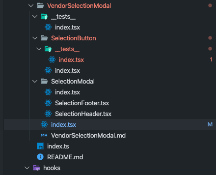
The indent guides (i.e. the vertical bar) helps. For example, here I can see that the index.tsx file that’s currently in focus (noted by the highlight) is in the vendorSelectionModal.
I found two VS Code settings useful for making my tree explorer more readable:
workbench.tree.indenttree.indentGuidesStrokewithinworkbench.colorCustomizations
Tree Indent
Within the vscode settings, add a workbench.tree.indent setting:
{
  "workbench.tree.indent": 20
}
The default value is 8 and accepted values are 0-40.
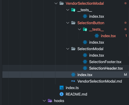
The difference is stark. Here’s the max value (40):

My preference is a more “modest” 20:

Tree Guide Stroke
The second solution is to use a color with greater contrast than the faint gray. Obviously this is something that can be set by finding a different theme, but if you like your theme and just want to tweak this setting, that’s also possible!
The indent stroke is configured within the settings.json in the key: workbench.colorCustomizations:
{
  "workbench.colorCustomizations": {
    "tree.indentGuidesStroke": "#ff0000"
  }
}
Side note: While this setting only affects the Explorer tree, you can also update the indent guides for within a file in a similar fashion. This setting, however has two variants: activeBackground (i.e. when you’re within the block) and background for all other cases.
{
  "workbench.colorCustomizations": {
    "editorIndentGuide.activeBackground": "#ff0000",
    "editorIndentGuide.background": "#ff00ff"
  }
}
This will then be visible on within your editor, like so:

Hi there and thanks for reading! My name's Stephen. I live in Chicago with my wife, Kate, and dog, Finn. Want more? See about and get in touch!