z-index: geometry, not magic
2019-05-07
|~2 min read
|385 words
It was one of those light bulb moments when things finally clicked. My colleague was describing how to ensure that my elements weren’t bleeding through with a Z-index and suddenly, I realized that the index was referring to a third-dimension.
Organizing elements on the DOM has always been confusing to me - how different elements get pushed aside, stretched, sent to the next line, etc. And, each problem has multiple different strategies - so there’s no one way to get the effect you’re looking for.
In my case, I was working on a menu, that when clicked, would create a popup.

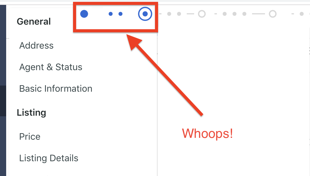
The problem was that the elements behind (or what I assumed would be behind) the menu were bleeding through (see the blue dots? Yeah, you’re not supposed to see them).

The issue, it turns out was that the popup menu was positioned absolutely within the window (so that it wouldn’t move other things around when it was present), but it was the same Z-index (or lower) than the SVGs that constituted the blue dots. This meant that as far as the browser was concerned, it should show them!
Cue the lightbulb moment.
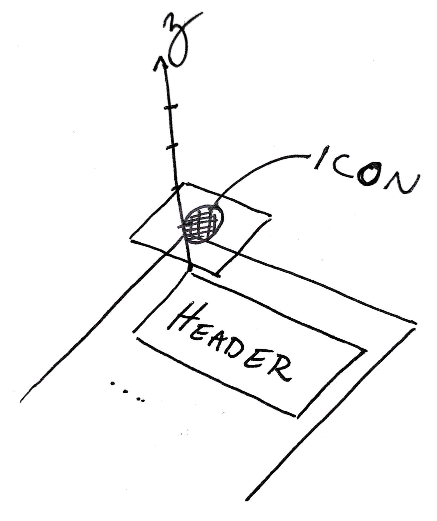
All we’re talking about is stacking different elements in a predictable way. Since at least one of them is positioned absolutely, they will not interact and push each other around. Which means that they’re like pieces of paper and can be stacked. If they have the same Z-index, which is on top is unpredictable.
This is because the Z-index refers to a Z axis!

I’d looked at a lot of different pages on Z-index, but for whatever reason, these two concepts never came together to click.
- Position absolute the element is not affected by (and won’t affect the position of) other elements
- Z-Index refers to the “height” of the element. The higher the index, the “closer” to the screen (aka the window through which we look at the DOM)
Once I saw Z-index as an axis in a three-dimensional coordinate system, visualizing the placement of the elements became much more intuitive.
Suddenly, the Z-index wasn’t magic. It was geometry. Demystifying it made it a tool I could use with confidence.
Additional Reading
Hi there and thanks for reading! My name's Stephen. I live in Chicago with my wife, Kate, and dog, Finn. Want more? See about and get in touch!